Jesse Michels
Jesse Michels

MAP Branding

CHALLENGE
Develop a brand language for the MAP Wellness Center that can be used on all marketing platforms, from print to web. The brand will play on an acronym built using the first letters of the founders names to tell a story of guidance through their clients journeys of mental health and wellness.  

UNIQUENESS
MAP will uniquely provide mental health services to clients with the diverse qualifications of its staff and partners. Having councelors with specialized accredations and calming personal styles will set it apart from clinical settings. MAP will build a calming almost spa like atmosphere that will allow clients to feel safe and comfortable to open up and begin their journey toward healing. 
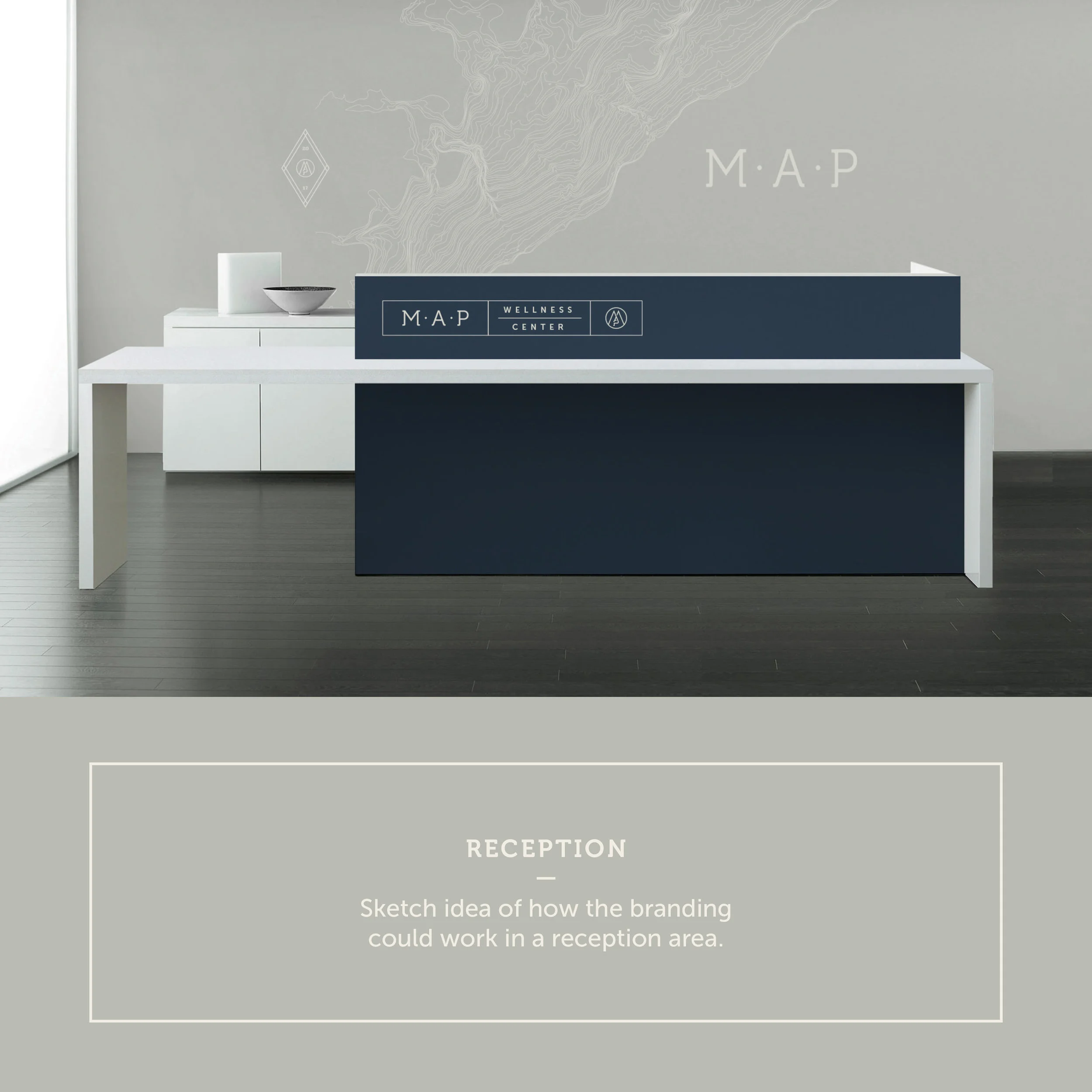
THE LOOK
MAP’s brand and look will convey a sense of calm and direction. It will be clean and legible without being steril or clinical. The look will convey a relaxing and comfortable  environment. 


View fullsize brand explanation_MAP.jpg
View fullsize brand explanation_MAP2.jpg
View fullsize brand explanation_MAP3.jpg
View fullsize brand explanation_MAP4.jpg
View fullsize brand explanation_MAP5.jpg
View fullsize brand explanation_MAP6.jpg
View fullsize brand explanation_MAP7.jpg
View fullsize brand explanation_MAP8.jpg
View fullsize brand explanation_MAP9.jpg
View fullsize brand explanation_MAP10.jpg
View fullsize brand explanation_MAP11.jpg
View fullsize brand explanation_MAP12.jpg
View fullsize brand explanation_MAP13.jpg
View fullsize brand explanation_MAP14.jpg
View fullsize brand explanation_MAP15.jpg
View fullsize brand explanation_MAP16.jpg
View fullsize brand explanation_MAP17.jpg
Branding, DesignJESSE MICHELSNovember 1, 2017MAP, branding, Logo, Icon
Facebook0 Twitter LinkedIn0 Reddit Tumblr Pinterest0 0 Likes
Previous

Wheelers

Design, EpicureanJESSE MICHELSMarch 1, 2018epicurean, Wheelers, Bike To Work
Next

All-A-Boards

Design, EpicureanJESSE MICHELSAugust 16, 2017epicurean
Maple Grove
jesse@jessemichels.com