Jon Howard Branding
CHALLENGE
Develop a brand language for Jon Howard that can be used on all marketing platforms, from print to web. The brand should make the name Jon Howard synonymous with physical fitness, training, and coaching. The brand morphed from one defined business objective to a top tier naming of Jon Howard and a segregation of the different business objectives that Jon offers. The challenge is to visually consolidate Jon’s coaching abilities as well as the different physical activities he is involved with everyday.
UNIQUENESS
Jon Howard is unique in his broad range of expertise and consistent real life experience. Jon has been coaching and training for years, and continues to participate in extreme races and engages in the athletic community.
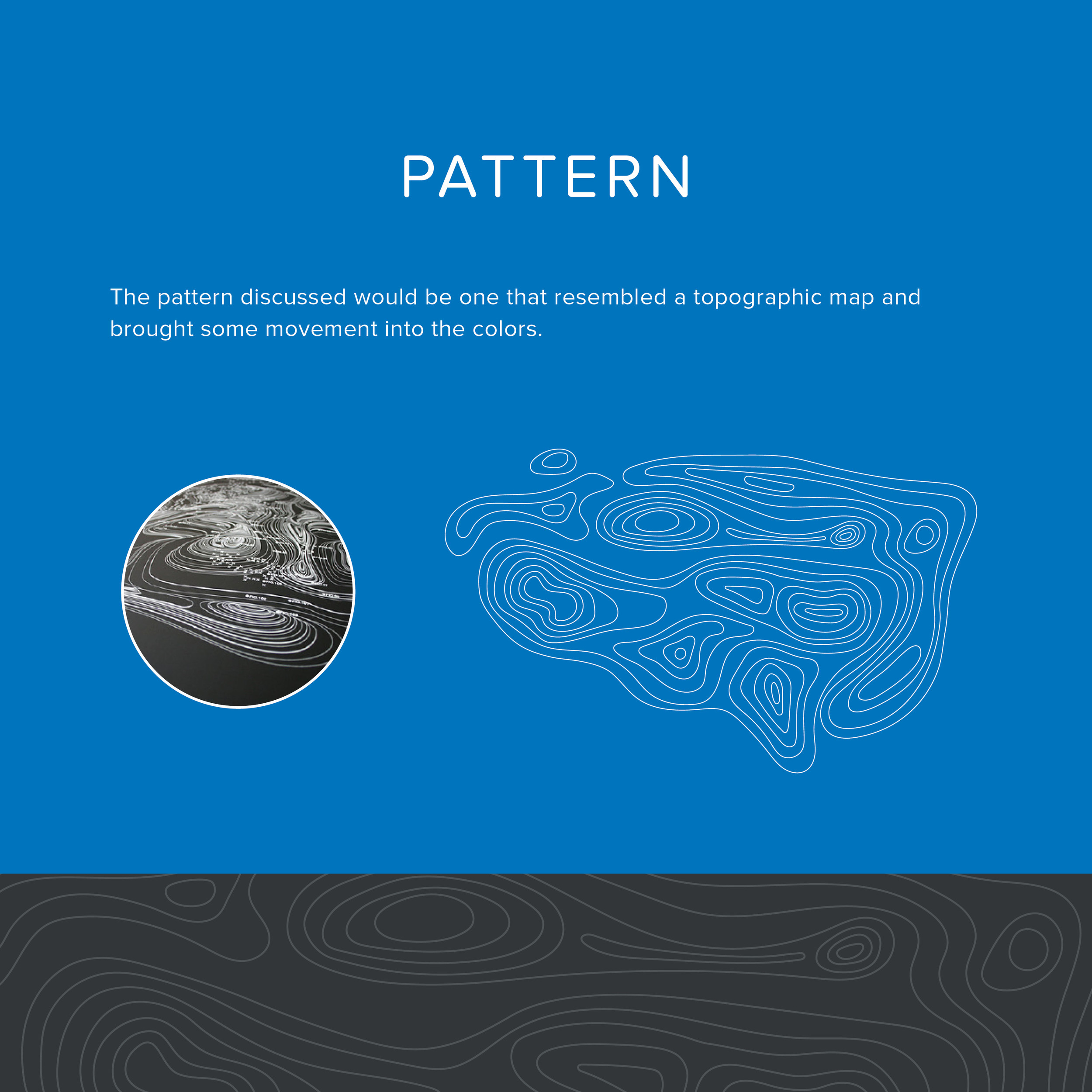
THE LOOK
The look for Jon Howard should convey the passion, friendlyness, determination and endurance that Jon takes to each and every endeavor. This look will represent the man behind the brand. When Jon shows up to meet with clients or to the events he is participating in, this brand will stand out to everyone he meets giving them a finished first impression.
Jon thinks the world needs more color. Bold and determined the color scheme and graphical setup should invoke a bold sense of vibrance.
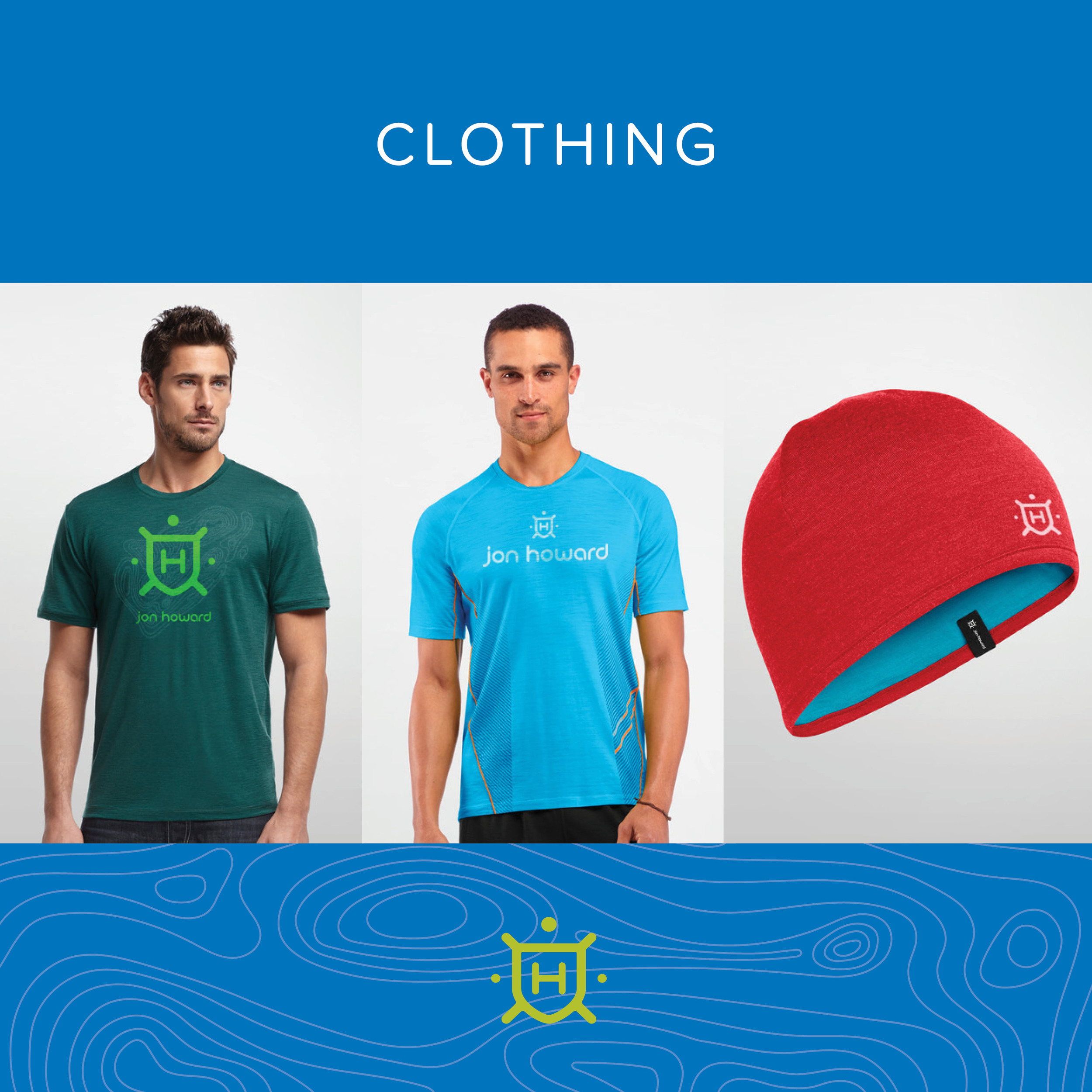
Since Jon is branding his own name, the modernizing of a family crest seems to be an obvious starting point.
Jon wants his name/word mark to be clean and approachable. A lowercase sense of humble, while the icon stands a bit more authoritative, firm, and mature.